Shirts By Mike
This project is a proposed redesign of an old t-shirt e-commerce website.
Problem.
The original Shirts By Mike website is unresponsive and the website design does not appeal to the target audience that buys graphic t-shirts. The original website was unable to promote t-shirts that are on sale or new in stock.
Overview.
I approached the redesign by focusing first on how the website would work on mobile-first. I wanted the components to flow horizontally on the desktop and stack on top of each other on the mobile version. I wanted to include elements that would help users find products easily. I included categories (women’s, men’s, kids and sale items) on the navigation and a search bar in the header to help achieve this. On the homepage, I also included call to actions of the different t-shirt categories to further help users and also promote the different t-shirt categories available on the website.
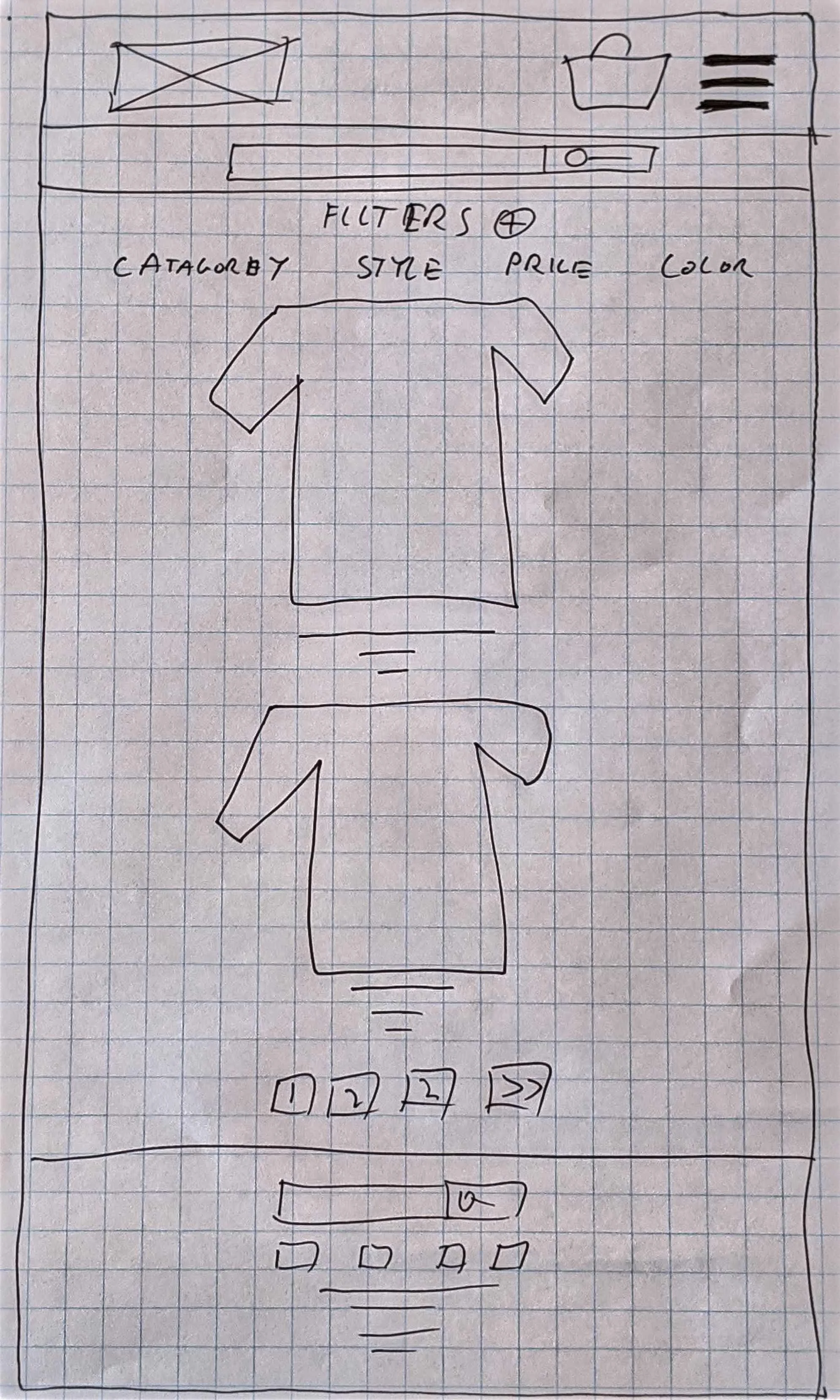
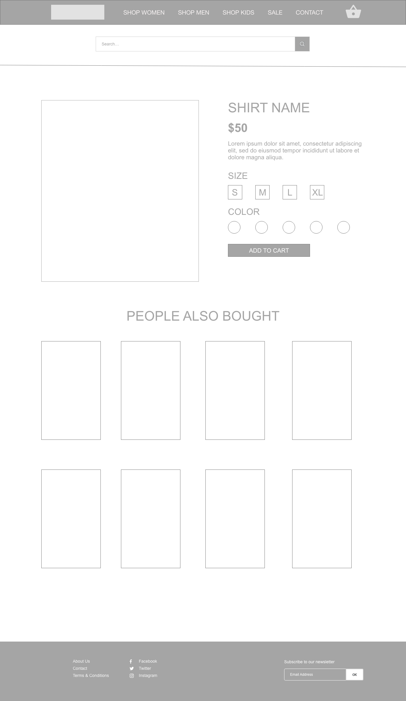
On the product categories pages, I wanted to include filters that would allow users to search for items based on style, price and color. On the individual product pages, I wanted to make it as easy as possible for users to see the price, a brief description of the t-shirt, the sizes available and the colors available. On these pages, I also wanted to give users the option to add a product to the shopping cart to purchase later along with other selected t-shirts.
On the contact page, I wanted to give the user the option to specify what they want to contact the company about. Based on what they selected other form options would appear to make it easier for the user to write their message e.g if they select Cancel Order then a field Order Number would appear. This will also give the support team the info they need to provide quick support.
Audience.
Target Audience
Mostly ages 16-35
Primarily based in the United States
Treehouse students
Lifelong learners
Values community
Playful
User Persona
Basic info (age, location, job, salary)
29, Seattle, Customer Support Specialist, $60,000
Goals & Needs
Wants to purchase fun graphic t-shirts for a good price
Behaviours
Browses websites efficiently and makes fast decisions on liking or disliking a product
Frustrations
Frustrated by hard to navigate websites and multiple steps in purchasing products online
Solution.
While coming up with my initial ideas my main focus on how I can make the following key features easily available on the desktop and mobile versions of the website: product search, product categories, featured shirt, company info, shirt examples, footer and the shopping cart.
I first used the crazy eights method to quickly come up with different home page layouts for the desktop version of the website that would display the key features listed above. I then did a second crazy eights session to quickly come up with different layout options for the mobile version of the site.
I changed some small elements between the sketches and the wireframes as I realized these changes would improve the customers experience after researching some competitor websites. I added in a contact button on the navigation in the wireframes after completing the contact page sketch as I realized I had no clear link to an important page. I updated the call to actions for the shirt categories on the homepage to squares to make them stand out more. I modified the footer layout slightly by stacking the social media icons and aligning the newsletter sign up more to the right to make it stand out more.
Learnings.
The biggest take aways from this project was how important it is to research your target audience. This helps you focus on how this person decides what shirts they are going to buy, how they are going to buy and what can frustrate them when buying shirts. This helps you get into the mind of the user, develop concepts and iterate those ideas to build a product that creates a repeat visitor.


