WhooshMail
This project is a concept for a email marketing product.
The Problem.
A lot of the products currently available on the market are hard to use and can be expensive for new business owners. Users can get overwhelmed when creating a email template and can take a long time to create and launch their campaign.
Overview.
I wanted to make the new WhooshMail interface an easier alternative to what is currently available. I wanted a user to create and launch a campaign in as few clicks as possible.
I wanted the navigation to focus on what is important to the user: Campaigns, Subscribers, Reports to see how campaigns are doing and Help when they get stuck.
I wanted the information on these pages to be clear and uncomplicated so anyone can build, launch and track a campaign even if they are a novice to email marketing.
I also wanted the design to be clean and modern so it would also appeal to experienced users of other email marketing platforms.
I wanted the interface to be similar no matter if you are an Admin or a Basic user. This helps to make the transition from Basic to Admin easy. Also, it makes the development team’s job that bit easier as there are only slight differences between both levels so the core design can be the same.
Audience.
There are two users who I focused on for this concept: Admins and Users. Below I outline the characteristics of both personas.
Admin User
Mostly ages 40-60
Primarily based in the United States
Small business owners
High School/GED or Bachelor’s Degree
Ready to be their own boss
Pursuing their passions
Used their personal funds to get started
Basic User
Mostly ages 20-40
Primarily based in the United States
Work for a small business
High School/GED
Admin User Persona
Basic User Persona
Admin User Storyboard
Basic User Storyboard
Solution.
I first created the profiles for the both user types that will be using the product. I created a storyboard for both users making assumptions of what these users would be doing.
I did my initial sketches of the interface with variations of each main page. I narrowed down the sketches to my favourites and then developed the wireframes. I then created the prototype and did user testing with 10 people.
Taking that feedback I refined the prototypes to address the issues that was brought during testing. I then created higher fidelity wireframes and converted them into a prototype.
Solution > Sketches
Admin Select Template Sketch
Basic Template Page
Admin Review Email
Solution > Low Fidelity Wireframes
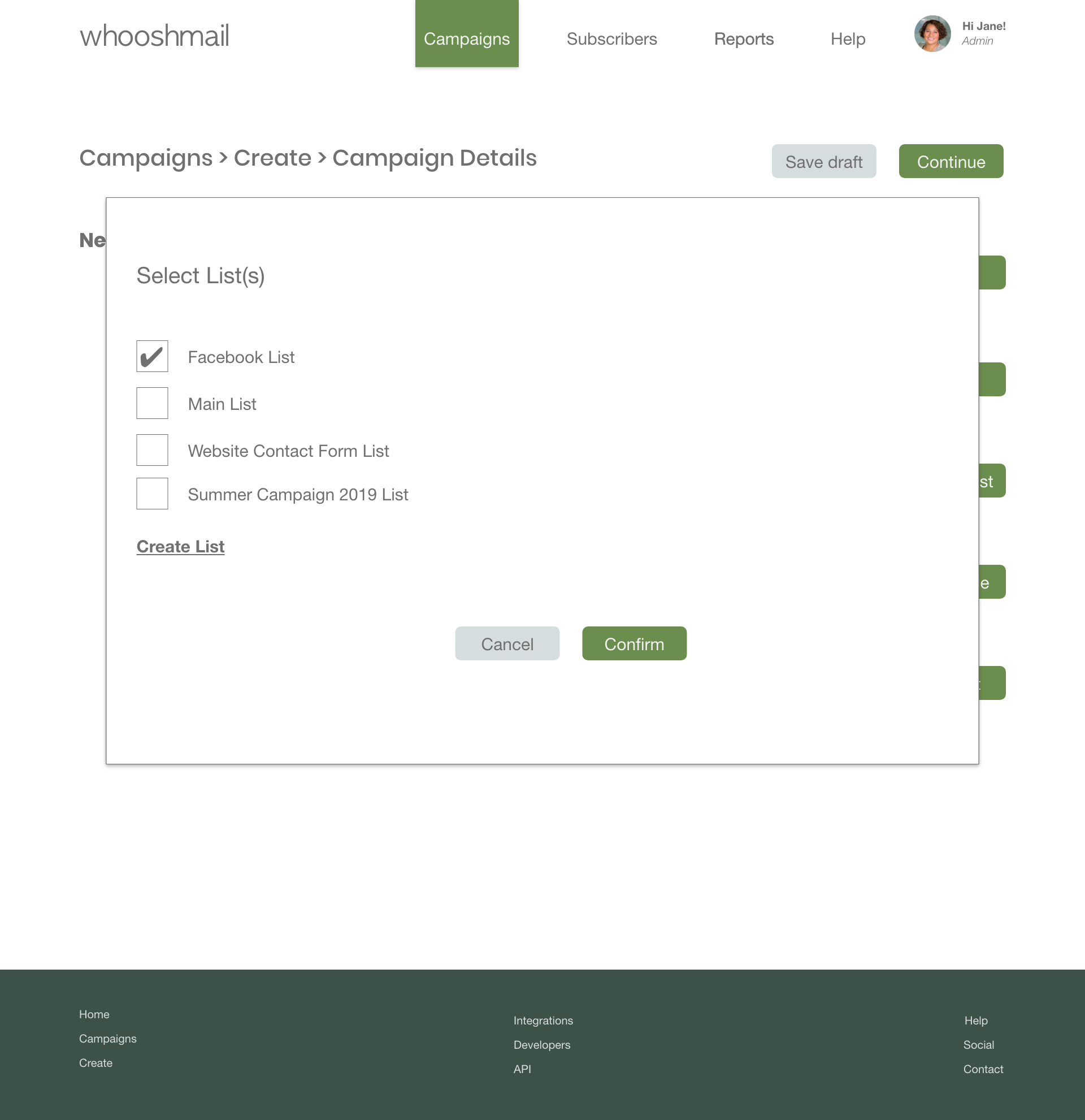
Solution > High Fidelity Wireframes
Admin Campaign Review
Edit Template
Email Campaign Settings
Import Contacts
Analytics Page
Solution > Prototypes
Low Fidelity Prototype
High Fidelity Prototype
Learning.
It was a big eye-opener to see why sketches, low fidelity wireframes, prototyping and user testing are essential when developing new designs. While it takes time, it saves time and avoids big headaches further down the road in production.
I learned that having good medium wireframes really helps in the development of high fidelity wireframes. Having that structure in place really helps to keep the production of the higher quality wireframes on track.
Having a panel with the branding guidelines is essential. Having a reference for what colours and fonts to use on hand saves a lot of time.


